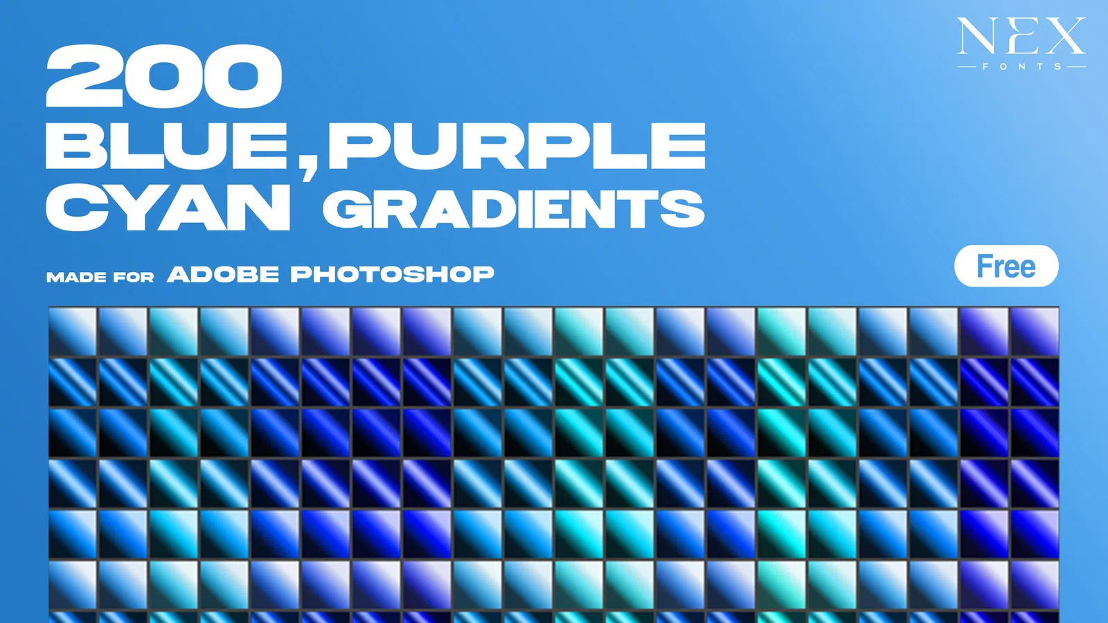
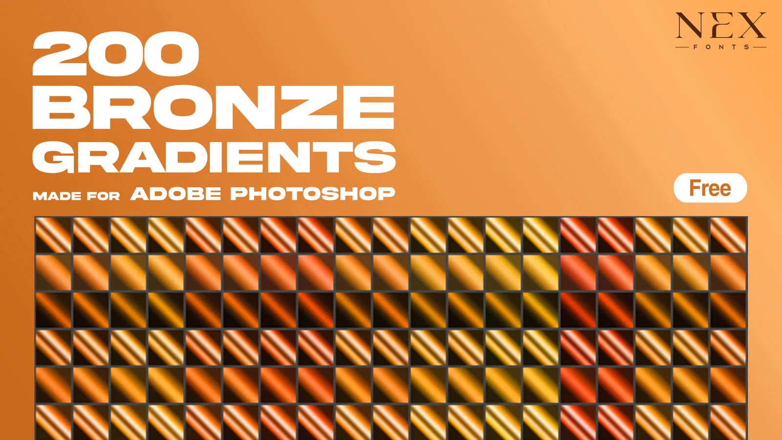
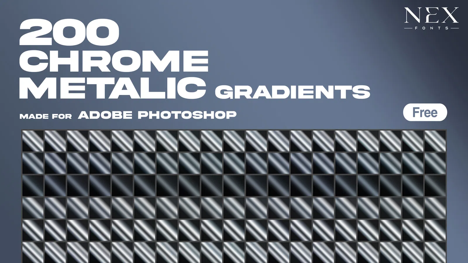
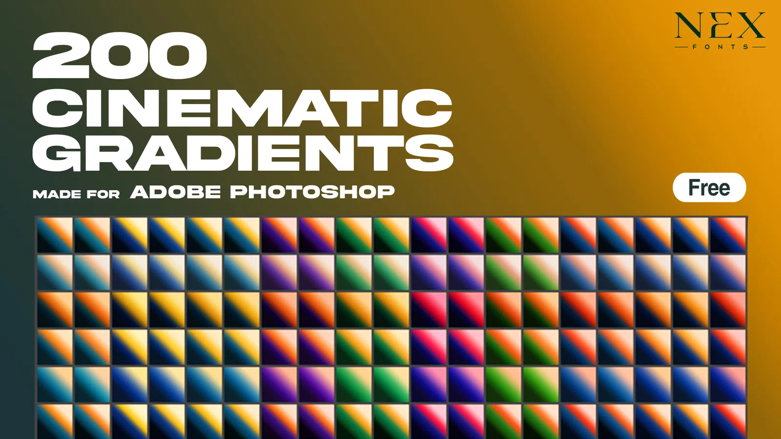
All resources

Colour and tone

Gradient Maps

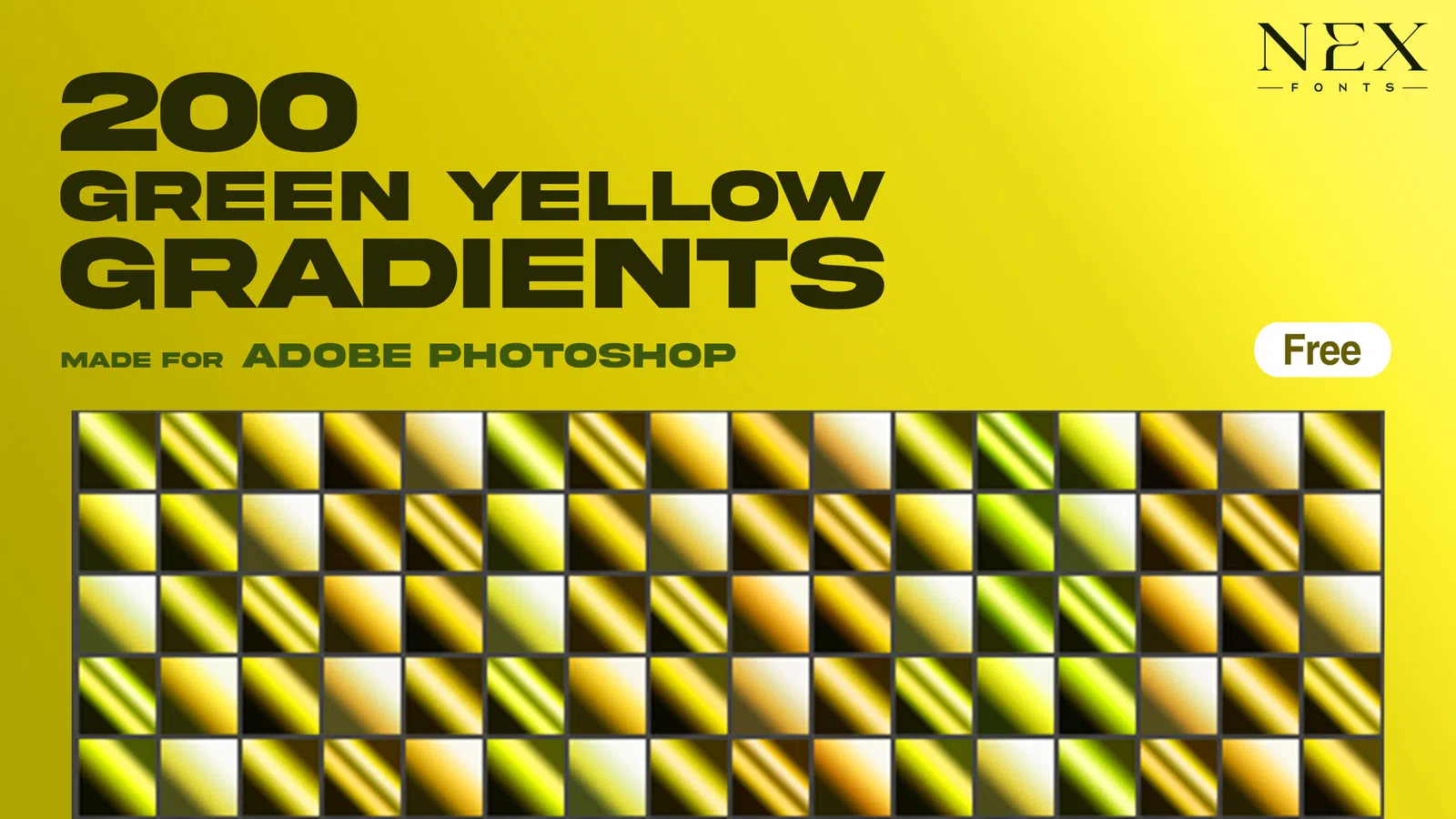
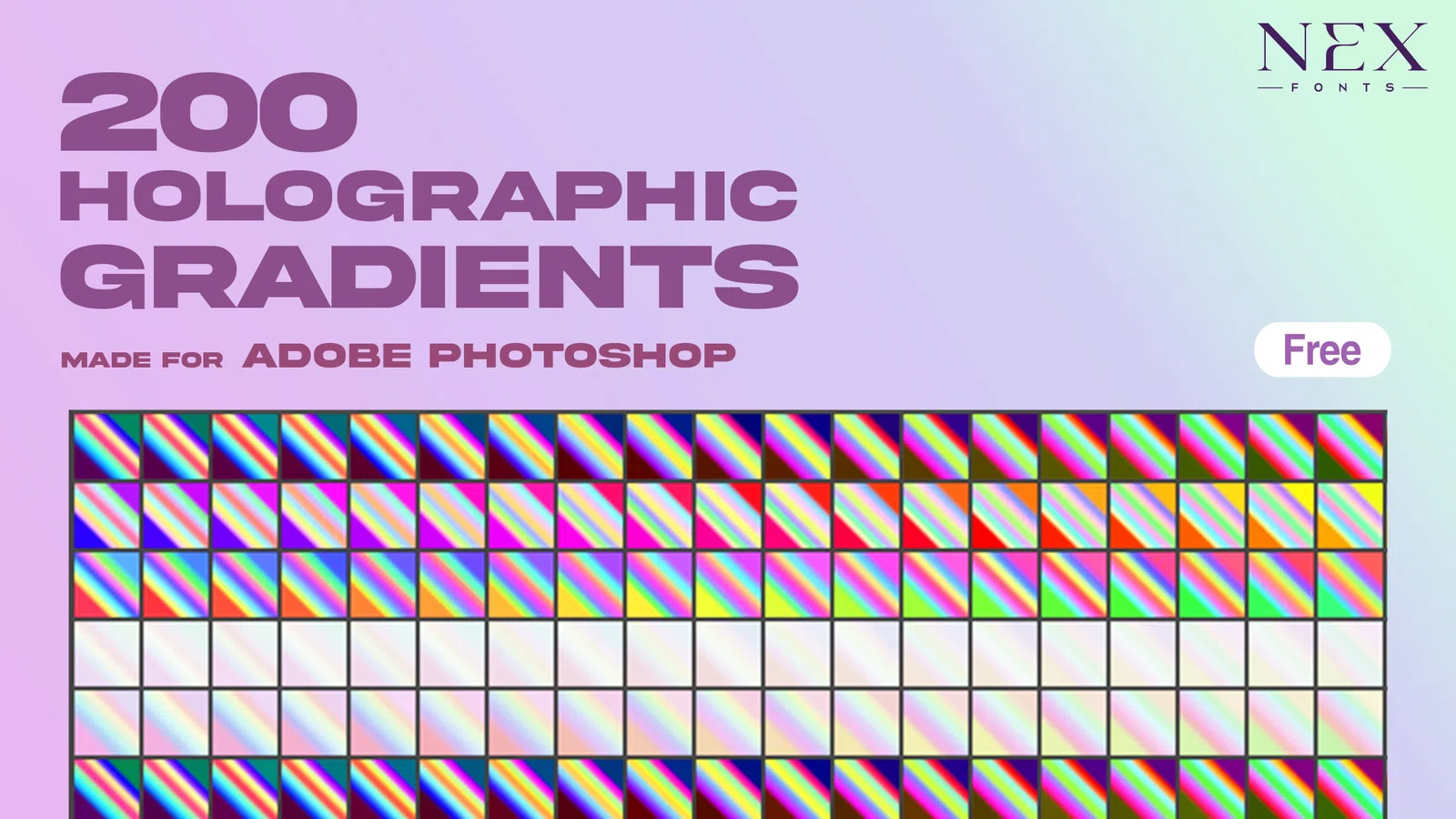
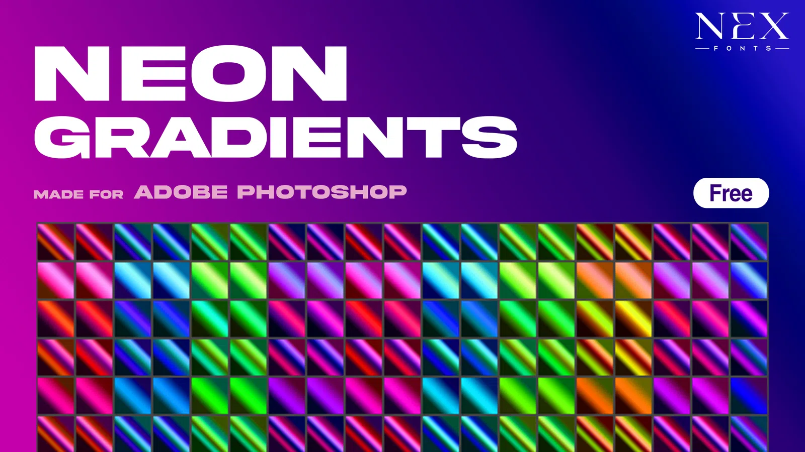
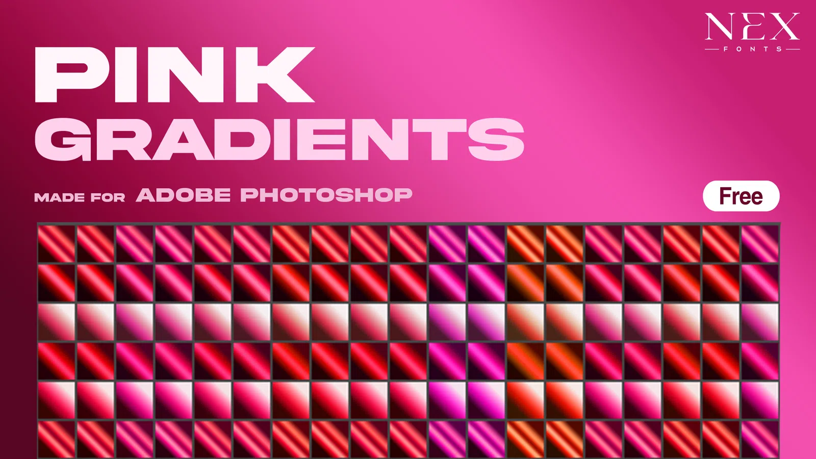
Curated gradient-map colour systems for cinematic grading, duotones, metallic looks, skies and experimental artwork.

GRDPSD

Curated catalog

32 gradient maps entries

Gradient Maps

Cinematic Sunset Maps

GRD

A curated colour-mapping collection for fast, consistent tonal treatments.

Gradient Maps

Chrome Tone Maps

PSD

A curated colour-mapping collection for fast, consistent tonal treatments.

Gradient Maps

Soft Duotone Set

GRD

A curated colour-mapping collection for fast, consistent tonal treatments.

Gradient Maps

Iridescent Colour Maps

PSD

A curated colour-mapping collection for fast, consistent tonal treatments.

Gradient Maps

Rose Gold Maps

GRD

A curated colour-mapping collection for fast, consistent tonal treatments.

Gradient Maps

Night Neon Gradients

PSD

A curated colour-mapping collection for fast, consistent tonal treatments.

Gradient Maps

Warm Skin Tone Maps

GRD

A curated colour-mapping collection for fast, consistent tonal treatments.

Gradient Maps

Teal and Amber Maps

PSD

A curated colour-mapping collection for fast, consistent tonal treatments.

Gradient Maps

Silver Metallic Maps

GRD

A curated colour-mapping collection for fast, consistent tonal treatments.

Gradient Maps

Dreamy Pastel Maps

PSD

A curated colour-mapping collection for fast, consistent tonal treatments.

Gradient Maps

Deep Blue Maps

GRD

A curated colour-mapping collection for fast, consistent tonal treatments.

Gradient Maps

Bold Red Maps

PSD

A curated colour-mapping collection for fast, consistent tonal treatments.

Gradient Maps

Purple Atmosphere Maps

GRD

A curated colour-mapping collection for fast, consistent tonal treatments.

Gradient Maps

Bronze Finish Maps

PSD

A curated colour-mapping collection for fast, consistent tonal treatments.

Gradient Maps

Sky Colour Maps

GRD

A curated colour-mapping collection for fast, consistent tonal treatments.

Gradient Maps

Editorial Neutral Maps

PSD

A curated colour-mapping collection for fast, consistent tonal treatments.

Resource guide

Gradient maps for cinematic colour and fast art direction

Gradient maps remap image brightness values to a chosen colour range, which makes them useful for cinematic colour grading, duotones, chrome-inspired palettes, poster treatments and consistent campaign systems. Unlike a simple gradient layer, a gradient map responds to the highlights, midtones and shadows already present in the image.

Current design work often combines restrained neutral layouts with one expressive colour treatment. Gradient maps fit that workflow well because a single editable adjustment can create warm editorial tones, cool night looks, metallic colour systems or high-contrast social artwork while keeping the original image underneath non-destructive.

Cinematic colour gradingDuotone postersChrome and metallic palettesEditorial portraitsAlbum artworkBrand campaign colour

Practical workflow

  1. 1Add the gradient map as an adjustment layer above the image or group you want to affect.
  2. 2Check shadow and highlight colours first, then tune midpoint positions for skin and important details.
  3. 3Reduce opacity or use a blend mode when the full treatment is too strong.
  4. 4Save a project-specific preset only after testing the map on more than one image.

Guides for gradient maps

Use these practical guides before downloading, editing or using a resource in client and commercial work.

FAQ

Questions about gradient maps

What does a Photoshop gradient map do?

A gradient map assigns colours to tonal values in an image. Dark pixels receive colours from one end of the gradient, highlights receive colours from the other end, and midtones are mapped between them.

Is a gradient map the same as a normal gradient overlay?

No. A standard gradient overlay places a gradient across the canvas, while a gradient map recolours the existing luminosity of the image. That makes gradient maps especially useful for grading photographs and artwork.

Can gradient maps create duotone effects?

Yes. A two-colour map can create a fast duotone look, while three or more stops can produce richer cinematic, metallic or experimental palettes.

Why does a gradient map make skin tones look strange?

The midpoint or saturation may be too aggressive. Move colour stops, lower the adjustment opacity, mask the effect from skin, or combine it with a gentler colour correction layer.

Do gradient-map presets change the original image?

When used as an adjustment layer they are non-destructive. You can edit, mask, reduce or remove the effect without changing the original photo layer.

Can I use gradient maps for album covers and social graphics?

Yes. Gradient maps are useful for creating a repeatable colour direction across cover art, posters and campaign graphics. Test important skin tones and brand colours before applying the same map to every image.

How do I make a gradient map feel cinematic instead of overly colourful?

Use a restrained shadow and highlight palette, keep midtones controlled, and reduce opacity when needed. A small amount of contrast and colour separation often feels more cinematic than a highly saturated map.

Check the individual file details and licence before starting client or commercial work.